When people imagine their dream home, they think about spectacular windows for sunshine to enter and stay, a majestic living room with an antiquely stunning fireplace, or a captivating kitchen interior that is comforting in every aspect. However, finding everything fabulous in one place is far-fetched and so, the buyers keep realistic expectations and begin the search by looking at the real estate pictures available for their location. But who thought that those pictures can be a disaster! Everyone believes that when real estate agents and homeowners shake hands for listing the house for sale, they present the prospective buyers with impeccable pictures of the place but these hilarious real estate photos have altered that perspective with the unthinkable angles and elements included in them.
Not Your Conventional Bath
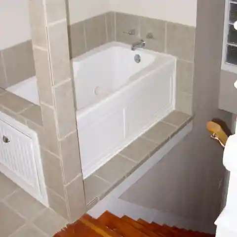
The real estate agents could really do better with the pictures of the house they are looking forward to selling. People would love to have a spacious bathtub for a relaxing end to their exhausting day. This picture is everything that the buyers are not looking for in a house! Who wants to climb up (too many) stairs to only end up with a tiny bath in the middle of nowhere? Definitely not the people who are shelling out for a new comfortable and warm abode.

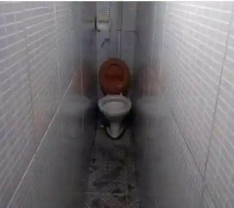
Squeezing To Relieve Oneself
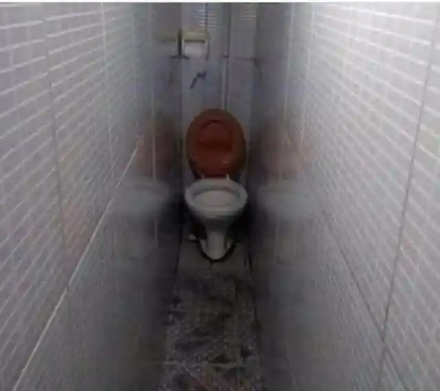
This looks like a newly appointed architect wanted to try something unique and built this alley that led to a toilet seat. Apparently, the listing agent found nothing wrong with this and gave the potential buyers a taste of what’s to come if they ever decide to make it their home. We wonder if anyone can even breathe while sitting in this narrow hallway and trying to relieve themselves! This real estate listing must have received quite a lot of criticism and we all know why.
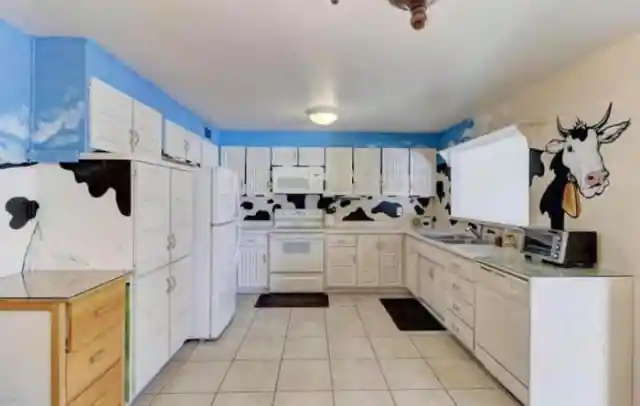
Cow Takes Over The Kitchen
The previous house owners may have a weird obsession with cows and this is how they “decorated” their kitchen to feel its presence. We hope the kitchen was the only place where the cow resided or else, it would have turned into a Moo abode and that’s not attractive. If anyone who isn’t consumed by the thought of cows, buys this house, they will definitely revamp this kitchen and make all the black and white disappear and let those counters and cupboards breathe without the cow watching them continuously!

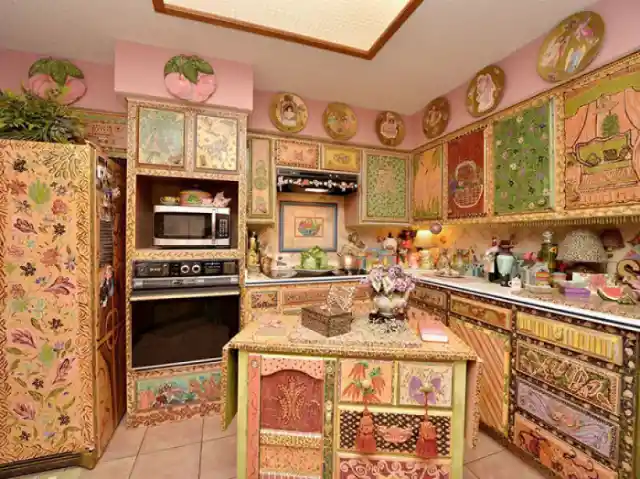
Who Likes A Crowded Kitchen?
This is not something the buyers would be pleased with while looking for a place to call home. The original owners of this house seem to be too fascinated by Moroccan art and included all of it in one place. We would be so distracted while cooking in there with excessive design patterns peeking from every corner. The listing agent could have skipped this part while putting the house on sale and people may have at least showed up for a walk-through.

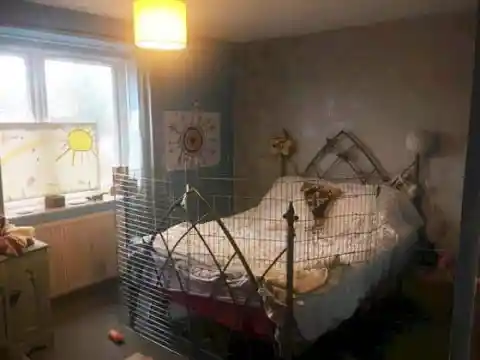
Home Away From Home… For Chickens
The homeowners forgot that the poultry netting is only for the chickens to make them stay at one place and used that wire mesh for their kids’ room. They might have extra mesh lying around but the result is horrifying. No one wants to lay in a bed surrounded by poultry netting. The real estate agent didn’t understand the buyers’ choices before putting this in the listing. This is why it’s important to do your homework before stepping into the real world.

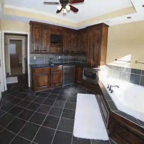
Surprise, It’s A Bath Tub!
Space issues? “No worries, we’ll fit the bathtub in the kitchen or bring the kitchen to the bathroom”, an architect reassured. We know this idea sounds ridiculous. No one is looking forward to settling in a house with a bathtub attached to the kitchen and the listing agents need to be more realistic while selling houses. Let’s try to look at this from the other side - maybe someone just wanted to unwind in the bathtub instantly after doing the dishes. That makes sense (to some extent!).

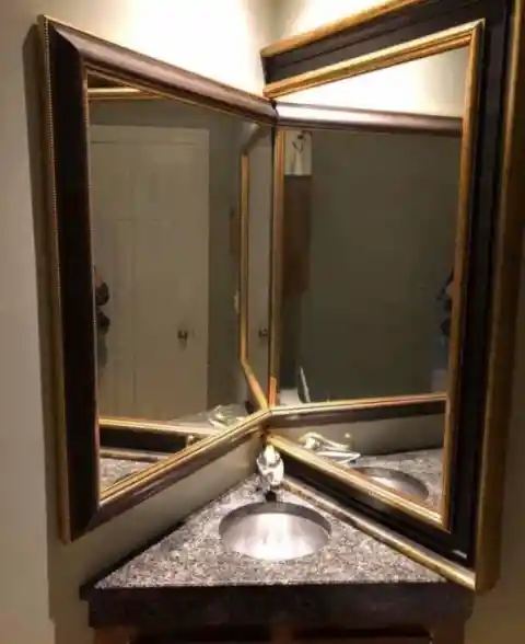
Mirrors On Sale?
The people who built this house especially this part of the home had a thing for mirrors and attempted at doing something creative with them. This is how their innovation turned out and wait, those multiple mirrors are not the only things that are troublesome in this scenario. Take a good look at that sink – it would only be useful in a toy house! Those mirrors and miniature sink are repelling all the buyers. It’s hilarious and bewildering at the same time.

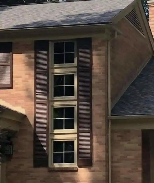
A Magic Spell On Windows
The builders were too engrossed in the construction of the windows that they forgot when to stop. This is the outcome of being dedicated without knowing the purpose of the job. Now, the house owners are regretting these windows while trying to put their house on sale. Everyone likes windows but an excess of anything can ruin the entire architectural design. We wonder if there’s any solution for this overly airy problem even if new people choose this place to be their abode.

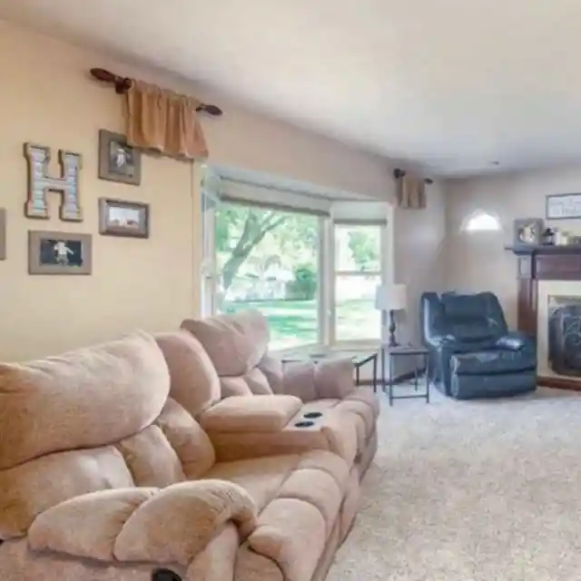
Spot The Secret Disaster
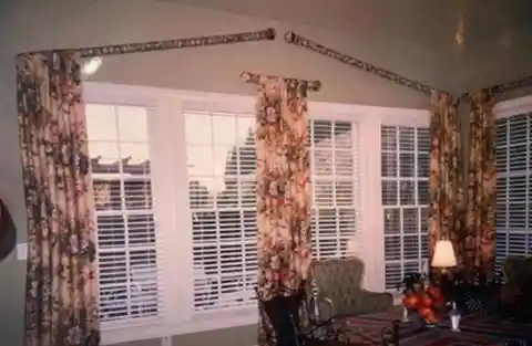
At first glance, this might look like an ordinary house but if you take a closer look, you will be baffled by it. This is a well-thought-out blunder as arranging such tiny curtains and rods is a task. What are they hiding behind those curtains? Is there a secret door leading to a world of magic? The windows that may have used a set of curtains are surviving without them. The buyers would only want to know the mind and logic behind this creativity.
Fulfill your Vacation Cravings
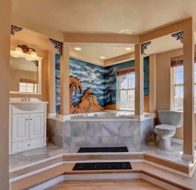
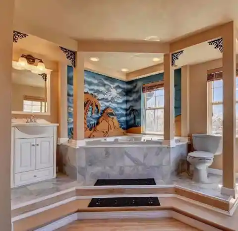
We all wish for a serene view while unwinding in a bathtub. It could be a stunning wall design that reflects peace and cheers us up. The ex-homeowner didn’t explain the serenity part of the idea to the designer and this happened. This view is the complete opposite of relaxing and no one wants to see a desert while taking a shower. It’s not rocket science but still, someone managed to mess this up.
Surfing And Rinsing
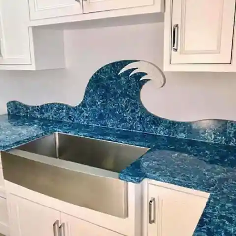
Those who are staying far away from oceans and can’t relish those waves and indulge in surfing every once in a while bring those waves to their kitchen interior. Those sea-patterned tiles are just the right pick for sea lovers and surfers. However, this won’t delight the other part of the population who are already consuming enough vitamin sea and would just want a kitchen to look like a kitchen with elegant tiles and a comfortable sink to rinse those dishes.

Too Far From Being Realistic
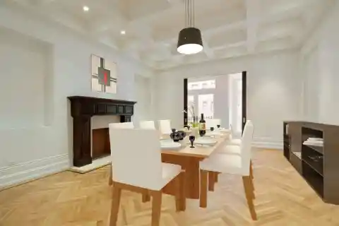
While virtual home staging has helped various agents and homeowners to present the house in an entrancing way, they have to be attentive with the technique as it can turn into a technological fiasco in no time. That’s what happened with a multimillion-dollar townhouse in Manhattan. The ones who wished to put it on sale wanted to attract the buyers with the virtual staging but failed at it terribly. It’s tough to fathom why someone would indulge in such stunts without a bit of expert advice. Let the professionals do their job.

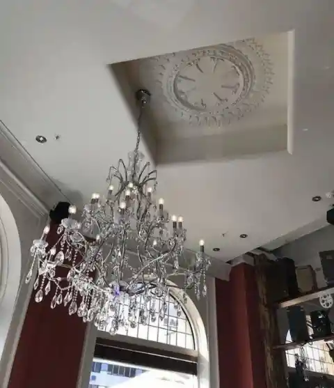
A Mysteriously Placed Chandelier
The ex-house owners must have splurged on a royal chandelier but when they realized that there has been certain confusion with the electric socket and ceiling plaster coving, they had to compromise with the position of the grandiose piece of interior decoration. But as the agents should know, people won’t be impressed by this chandelier and its mystifying placement on the ceiling. Despite this, someone posted the picture with the listing.

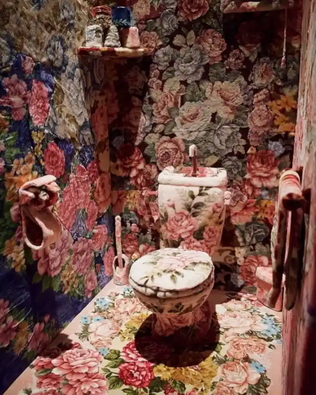
Pure Love For Carpet
Well, the only question that comes to our mind after viewing this loud picture is – how much carpeting is enough carpeting? This picture is emanating true love for carpets and we haven’t ever seen a toilet seat so soft and comfortable with floral prints all over. The bathroom seems to be the highlight of the house and the seller decided to post the “carpeted” picture to attract buyers. Wait, what’s up with the toilet paper holder and roll there? This requires an explanation.

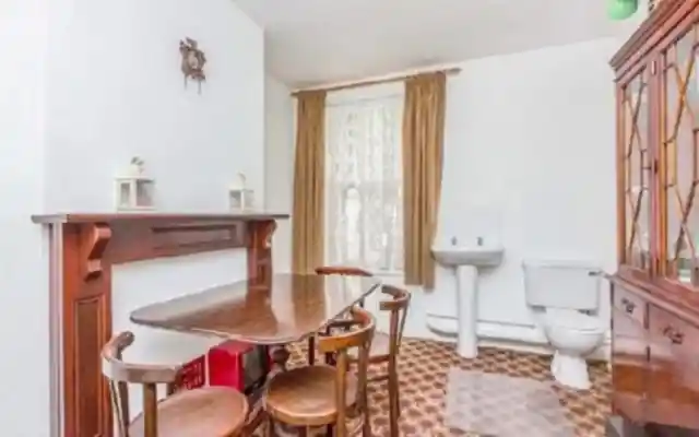
No Secrets… It’s All Out In The Open
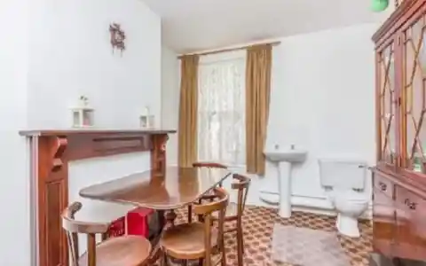
According to popular belief, people are supposed to relieve themselves behind closed doors when they are capable enough to do it alone. But that belief is trying hard to keep pace with the trends. This architect might be open-minded to an undesirable extent and brought the bathroom facilities right beside the dining room. There are no doors, no curtains – just an open space with a sink and a toilet seat. The new house owners will have to perform a renovation and uproot the open-toilet idea.
A Creepy Addition
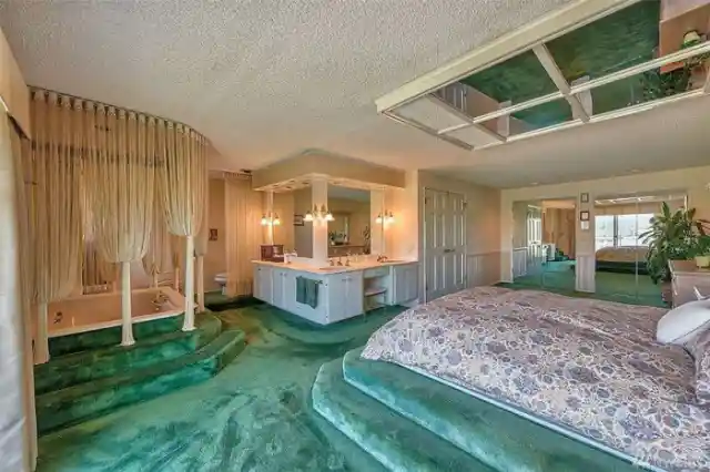
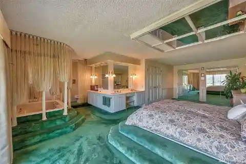
The whole design of this lavish room had us transported into another historical land until we spotted something creepy on the ceiling above the bed. Yes, that’s a mirror which is eerie and totally unexpected. Imagine paying a humongous amount of money for this house only to realize that you would wake up to your morning face staring back at you every day. That’s nightmarish! Only the previous house owners can reveal the story behind that mirror over the bed and if it did anything beneficial!
Curtains Trying A Trendy Challenge
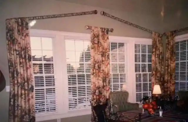
Whoever put up those curtain rods didn’t understand science. This is why our parents told us to attend all our classes in school and never skip any. This person surely made the worst life decision by buying those curtain rods and installing them in a completely illogical way. They can never draw the curtains and close them for a little privacy. Their entire living room is on display from the big window for the neighbors and other people passing by the house. Curtains are not performing their duties here.
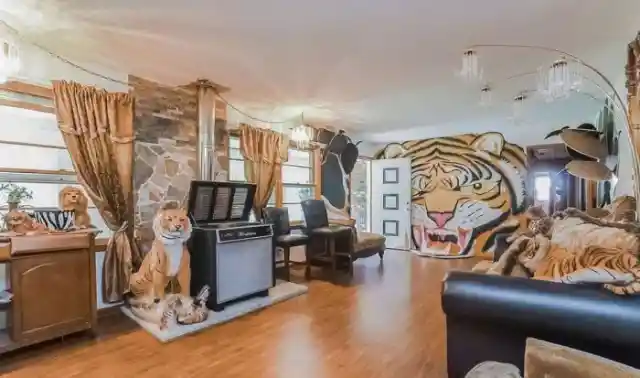
It’s A “Paw”rty House
If there’s an award for being immensely obsessed with cats in this world, then this person deserves it. They have shown their love for cats through their house with walls emanating that emotion in abundance. But the listing agents should consider all kinds of people while using such photos in the listings as not everyone is so fond of cats, zoos, and jungles. Such house listings should come with a warning sign for those who are not looking for anything eccentric.

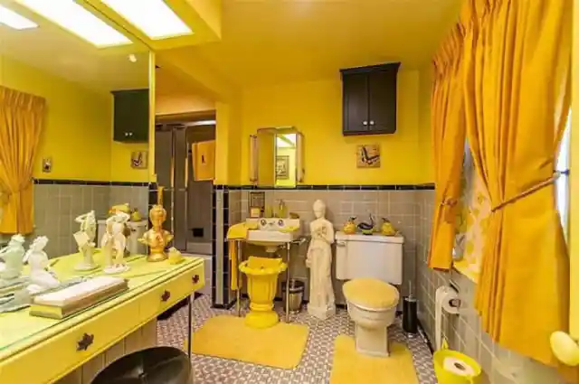
Welcome To The Yellow World
The bathrooms must be airy, breathable, and minimal but the person who designed this one or came up with this outrageous idea was rebellious and wanted to try something “quirky”. We can’t even count the number of things that are awry in this bathroom. From those figurines to the excessively bright color theme, this place is repulsive. The first rule of designing a bathroom is not using the yellow shade anywhere. The yellow walls are nauseating and we bet no one can freshen up at a place looking like this.

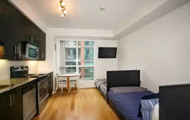
Cook, Lie Down And Repeat
These people brought the kitchen, the dining room, and the bedroom all in one place but we are not sure what the thought was behind implementing this. A dining room with a kitchen is a great concept but beds in the kitchen have no role to play. Even the studio apartments usually offer a little partition for the bedroom and the kitchen. On another thought, these beds can be for the chefs to rest. But hiring chefs for cooking our meals is not what most people can afford!

Painted By A Kid
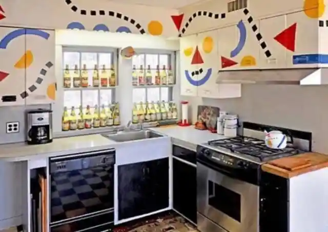
This is definitely not an adult creation or ideation as those vibrant hues and cartoon designs can only be made by a little artist who is living in that animated world. Interpreting the significance of this design is quite difficult as we are too engaged in the real world and have no clue about that lively cartoon universe. Speaking of this house listing photo, it might scare away some potential buyers as it might just not feel appropriate to many. Too much color for a kitchen!

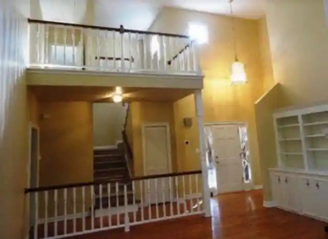
Extra Fencing For Security
The fencing on the second floor is essential for the safety of everyone in the house but when that fencing is also present on the ground level in front of the stairs, it is a perplexing situation. There is no risk of anyone falling from a height there. This is a serious design fail and any person who buys this property will have to get rid of this extra fence that serves no purpose. The real estate agent might have forgotten to take care of this blunder before posting the picture.

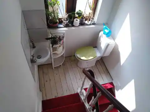
Staircase To… Heaven?
The contractor might have forgotten to make space for a guest bathroom downstairs and to compensate, they built one somewhere on the staircase. The previous house owners didn’t mind this location and even decorated the weird bathroom with plants. They could have at least used a curtain to give the guests some privacy in there. But open toilets are trending in the real estate listings as builders are adjusting those facilities without thorough consideration.

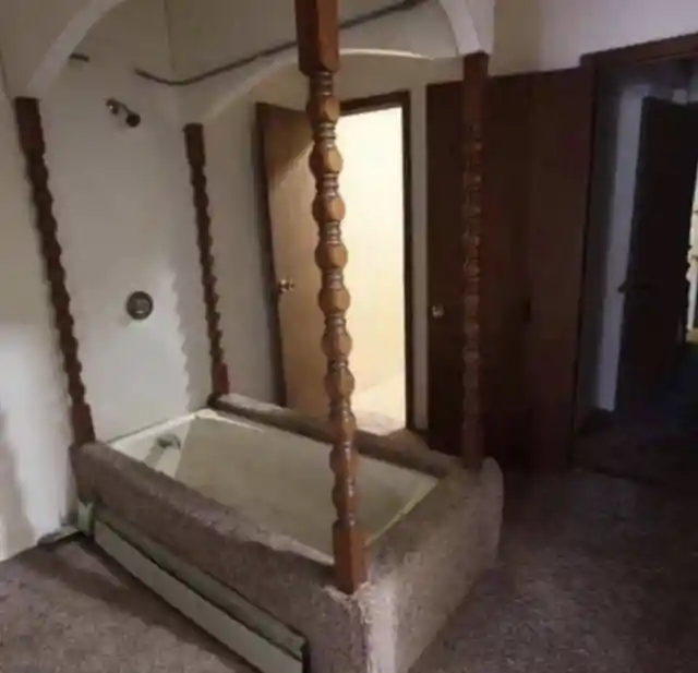
Perfect Bath Gone Wrong
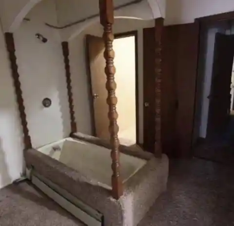
While we appreciate the carpeted floors around the bathtub, the rest of the design is bizarre. Was this supposed to be a king bath? We feel sorry for the person who wanted this to have a royal touch to it but ended up with this awful bathtub setting. Moreover, the size of the tub is really upsetting even for a baby. Those wooden supporting rods are ancient and not antique. Had the ex-house owners taken a professional’s opinion, they would have saved themselves from this embarrassment constructed in their home.
Prioritizing Comfort And Convenience
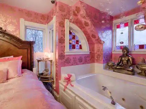
When you are too lazy to take a walk to your washroom after waking up, this kind of setup would be the most convenient for you. All you have to do is fill the bathtub right next to your bed and transfer yourself into it once the water has reached the mark. This dreamy room has taken the attached bathroom to another level and we can’t tell if the buyers would be impressed by this arrangement in a bedroom.

Double The Trouble
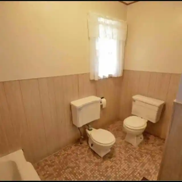
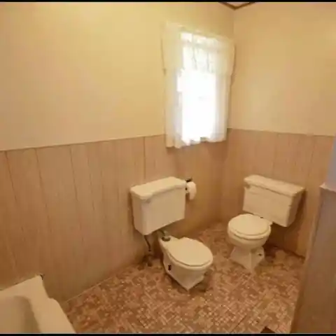
The previous house owners may have an extra toilet seat that they didn’t know where to fix and this is how they dealt with it. A couple can do all things together but performing this business together is excluded from that list of “romantic things-to-do”. The point to note here is that the real estate agent actually used this photo for the listing. There must be an explanation for this and we guess it will never reach us.
Welcome To The Golden World
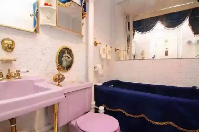
This bathroom must have undergone customization for some special visitors as the tub’s velvet covering and golden additions tell that story. The sink and the seat are painted in an unusual shade that we don’t come across routinely. Those curtains seem to be fixed on special demand and that velvet blue tub cloth is raising an insane amount of questions. What happens to it when someone actually takes a bath in it? Is it magically waterproof? We wish we could witness this in person!

Photoshop Isn’t Child’s Play
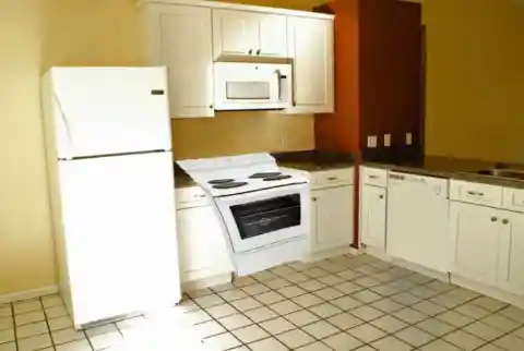
People edit one picture in Photoshop and start calling themselves experts in Photoshop editing. However, the truth is always bitter to hear and we have this picture to prove how those imaginary skills can ruin a real estate listing. We understand that the person who edited this wanted to show that the kitchen has enough space for a stove and an oven but the way they conveyed this information was awful, to say the least. The stove is headed somewhere towards the refrigerator, breaking the symmetry.

It’s Sunny In The Kitchen
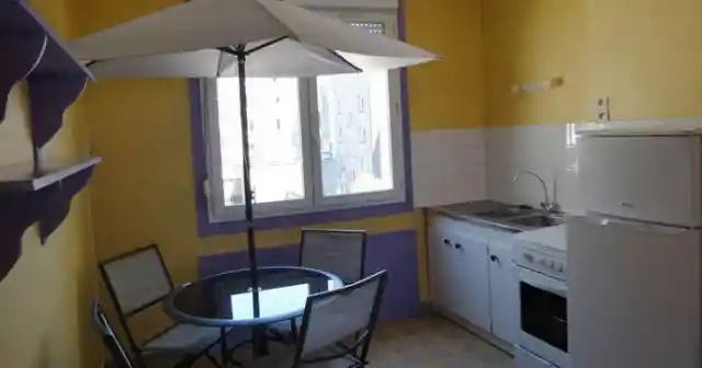
When you can’t have a nice open garden space for sipping tea or coffee in the morning sun or a glass of wine in the afternoon, this is what serves as the best alternative. Bring garden chairs and a table into your kitchen right beside the window that welcomes sunlight. If you don’t have a dining room, this would be a perfect place to enjoy your meal under an umbrella that might be shielding you from the embarrassment of eating the old sandwich that was rotting in the fridge for 4 days.

Butterflies In My Stomach
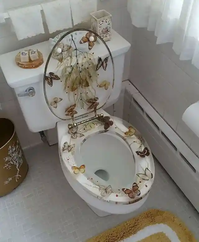
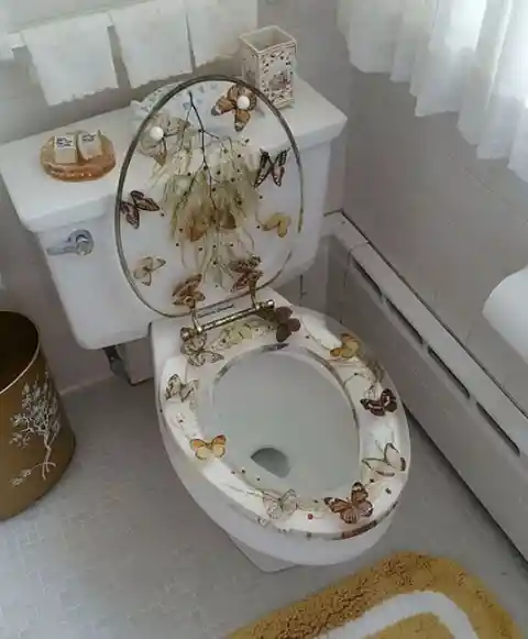
The one who decorated this toilet seat must have taken the phrase “butterflies in my stomach” way too literally. Those butterflies are meant to be in the garden or anywhere outside where they can breathe and fly freely. Why would someone want to trap those little creatures in the glass covering of a toilet seat? Even if someone made this choice, another genius mind decided to use the picture of a toilet seat studded with butterflies in the real estate listing. This is not flattering in any universe!
